No one expected a collaboration between two creative giants, Brandon Sanderson and Kazu Kibuishi, to be titled The Most Boring Book Ever. Luckily, that’s the irony of this innovative and experiential story.
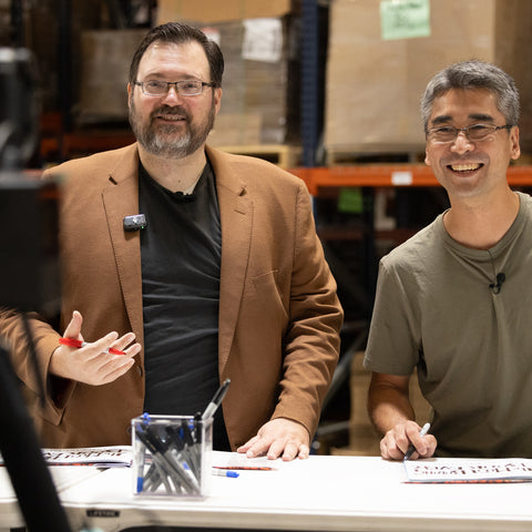
Since this is Brandon’s first picture book, he knew he needed an expert onboard to bring the project to life. Enter Kazu Kibuishi, a renowned graphic novelist and illustrator known for his Amulet series. (Amulet is a favorite of ours here at Dragonsteel, and Kazu graciously signed many of our books when he joined us at the office for the day. 🥹)
We were all over the moon when Kazu agreed to lend his talents to The Most Boring Book Ever. Watching the project come to life has been such a blast, and we can’t wait for you all to experience it. Only a few more days until the release on September 24th!
Kazu let me sit down with him during his visit to Dragonsteel’s office for an interview. This conversation offers a deeper look at Kazu's creative process, his collaboration with Brandon Sanderson, and the inspiration behind his artwork. Let's explore how Kazu brought his unique flair to this one-of-a-kind project, exclusively for The Cognitive Realm's readers.
An Unexpected Collaboration
Kazu’s involvement with illustrating The Most Boring Book Ever began unexpectedly. His agent, Judy Hansen, informed him of an opportunity introduced by Connie Hsu at Roaring Brook Press. “It sounded like a good match for my artwork,” Kazu recalls, adding that he agreed to the project after completing Amulet 9. The synergy between Kazu’s art and the book’s concept was undeniable. Kazu is an expert in fantastical, larger-than-life art, which is exactly what Brandon wanted for this project.

“Brandon knows how to work with other creators,” said Kazu. Brandon encouraged Kazu’s creative freedom and frequently adjusted his text to align with Kazu’s illustrations. “We were pretty much on the same page about how this project should look from the beginning,” Kazu notes. “It was easy and wonderful working with Brandon.”
Discovering Sanderson’s World
Kazu was only a bit familiar with Brandon's work before diving into The Most Boring Book Ever. He’d read Mistborn, but hadn’t ventured beyond that title yet. In some ways, it helped him go into this project with a clear head. “I worked with a blank slate,” he explains. Brandon encouraged Kazu to maintain his own artistic style for the book.
“I did reach out to Brandon to ask about inspirations, and he said he just wanted the book to look like my work!” Kazu exclaimed. “Brandon did eventually suggest I look at The Voyage of the Basset by James Christensen, so that book became my starting point.”
Before Brandon lent his suggestion, Kazu was already looking elsewhere for inspiration. “Prior to the suggestion [James Christensen], I was already looking at artwork from Monty Python and other fantasy artwork from the 70s to the 90s.” These influences allowed for a gorgeous fusion of humor and fantasy within the illustrations.
I’m particularly interested in the artistic inspiration from the 70s, 80s, and 90s. This was such a defining era for fantasy art. When I chatted with Michael Whelan about the Wind and Truth cover, he had thoughts about how those decades influenced the image of fantasy as a genre in the collective consciousness. Seeing different artists interpret the impact of this era is especially interesting.

Cover of Monty Python and the Holy Grail.
Crafting a Visual Experience
One might wonder how an illustrator makes “boring” elements visually engaging. For Kazu, creating exciting art for the book was far from challenging. He admits, “Making artwork that isn’t boring was not a challenge at all, since Brandon did write some exciting prompts in the manuscript.”

The irony is spectacular.
While he initially leaned toward a steampunk aesthetic, the final art ended up closer to his usual look. “I can’t escape my cartoony style!” I tell him that we wouldn’t have it any other way. 😌
I’m curious about how Kazu defines this “cartoony” style, though. Kazu goes on to explain his style in more detail. “My art always tends to look the way it does, and the best way to describe the style is probably ‘friendly’ and ‘fantastic’. Since I generally can’t escape this friendly and fantastic style, I’ll just lean into it by trying to push it into sci-fi and fantasy genres and allow that friendly fantastic style to mix in with the genres.”
The process of designing illustrations that complement such a unique book concept required balancing simplicity with creativity. “Since we never leave the boy as he falls, the angle we view the story from is static,” Kazu shares. This framing allowed him to make the environments dynamic and detailed, to entice readers to explore each scene thoroughly. “That forces me to use whatever enters the frame as a means to depict the larger world around the boy. Since the framing and situation are simple, I can then make whatever enters the frame be as complicated and fantastic as possible without getting the reader lost.”
It may be fair to say that Kazu’s appreciation for cinema could be part of the reason he considered the composition of the art in this way. More on that towards the end of this article!
Toward the book’s end, as the city comes into view, the illustrations become more intricate, inviting readers to slow down and absorb the details. Kazu explains this, saying, “Once he enters the city, I decided that adding detail to the environment is one way to get the reader to slow down and look around, so the illustrations toward the end of the book took much longer to create than the ones toward the beginning.”
When asked about his favorite illustration in The Most Boring Book Ever, Kazu cites the first full-size dragon illustration. “I could sense that this image would become the iconic picture from this book as I was drawing it,” he reveals. Such pieces exemplify Kazu’s ability to capture imaginations and leave lasting impressions. And, I’d have to agree. This image of the dragon from the story is particularly striking and visually distinctive.

How Film Impacted Kazu’s Creative Career
Kazu’s creative ingenuity extends beyond books. He’s been massively influenced by iconic films and even worked with the Criterion Collection at their request due to his film reviews on his blog. When I bring up film, Kazu says, “Oh gosh. If we start talking about movies, we can be here forever!” I immediately take this to mean we’re cut from the same cloth.
From the hour-long discussion we had about movies, one of the most fascinating revelations was Kazu’s initial experience with Aliens and how it influenced his art and writing.
“When I watched it, I was probably too young—I would have been eight years old—and the whole movie blew my mind. Not only because it was a supposedly cheesy genre picture that was critically acclaimed, but because the designs of all the vehicles and weapons and creatures seemed so far ahead of their time. The concept design, the sound design, the set design, the cinematography, and the amazing performances were all working at such a high level for something that seemed like it wouldn’t deserve such treatment.”

A creative genius in the making.
The film’s innovative design and storytelling left a profound impact. Kazu explains how he applied the inspiration to his own work, saying:
“It made me inspired to make stories that would do something similar: I wanted to create work that people might underestimate, then when they experience the work they are so surprised by its quality that they remember it for a very long time.”
What’s Coming Up Next for Kazu
After working on such a distinct project, what does the future hold for Kazu Kibuishi? He continues to work on his next graphic novel, returning to his creative roots while remaining open to new picture book opportunities. “I’ll just continue to put together the [stories] that seem most interesting to me regardless of the medium or format,” Kazu says. “In the meantime, I hope people enjoy The Most Boring Book Ever!
Embracing the Irony: A Final Note
As we’ve explored, Kazu Kibuishi’s journey in bringing The Most Boring Book Ever to life showcases not only his extraordinary artistic talents but also the magic that happens when two creative visionaries collaborate.
Kazu’s unique ability to transform the mundane into the marvelous offers readers an experience that does indeed defy expectations. His work reminds us that even the most seemingly ordinary tales can hold extraordinary adventures.
With its release just around the corner on September 24th, don’t miss the chance to dive into this delightful fusion of humor and artistry. Pre-order your copy of The Most Boring Book Ever today and prepare for a journey that’s anything but boring!

Kazu's drawing for Brandon.

Brandon's drawing for Kazu.


Comments (0)
There are no comments for this article. Be the first one to leave a message!